
In the ever-evolving digital realm, the success of your website can be distilled down to a single element: the user experience. Responsive Web Design (RWD) emerges as the linchpin that could be the game-changer, determining whether a visitor engages with your content or hastily exits your page.
Imagine this scenario: you’re navigating a website on your smartphone, and reading a simple sentence becomes an ordeal of squinting, zooming, and awkward sideways scrolling. It’s a frustrating experience. Now, transpose that inconvenience onto your customers interacting with your website. Not the optimal scenario.
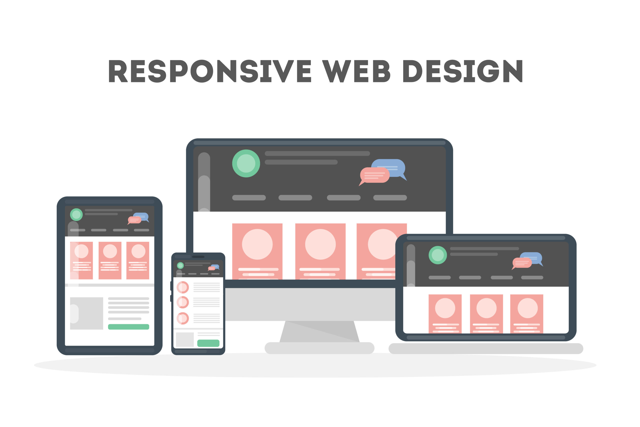
Responsive web design is the solution, ensuring that your website not only looks but seamlessly functions across an array of devices, encompassing smartphones, tablets, and desktops.
At SEO Web Logistics, we recognize the imperativeness of staying at the forefront of technological progress. Responsive design transcends being a mere tech buzzword; it’s a fundamental aspect that cannot be overlooked. As mobile browsing continues its upward trajectory, neglecting RWD might mean forfeiting a substantial share of your audience.
Before we delve into the intricacies, let’s address the foundational aspects. As a business owner, why should you prioritize responsive web design, and how can it impact your bottom line?
Decoding Responsive Web Design
Envision designing a visually captivating event poster that you want everyone to appreciate. It looks stellar on a billboard, but picture the chaos if you attempt to fit it into a tiny picture frame or expand it to cover the side of a building. That chaos mirrors what transpires when websites lack responsive design. It ensures your website adapts effortlessly to any screen size, whether it’s a smartphone, tablet, or desktop.
Responsive design isn’t just tech jargon; it’s the contemporary approach to website design in a world where mobile browsing is no longer a trend but a tangible reality. With the exponential rise in mobile users searching for products and services, having a website that adapts to various screen sizes is not just advantageous – it’s imperative. Failure to do so might mean losing customers to competitors with more user-friendly sites.
By forgoing responsive design, you’re essentially closing the door of your digital store to a significant portion of your audience – a luxury you cannot afford in today’s competitive business landscape.
The Essence of Responsive Design
Fluid Grids: A Seamless Viewing Experience
Fluid grids ensure that your content fits perfectly, regardless of the device. Whether viewed on a massive desktop monitor or a convenient smartphone, your content adjusts, resizes, and positions itself within the predefined structure, maintaining a consistent design aesthetic.
This feature is a game-changer, preserving the meticulous design you’ve invested time, effort, and resources in. It ensures that your brand image remains consistent, irrespective of the device.
Flexible Images
Breathtaking images showcasing your products or services lose their impact if they don’t scale appropriately. Flexible images effortlessly scale up or down, maintaining visual appeal across devices and conserving bandwidth. This is crucial for users on limited data plans, providing a better experience by serving the perfect image size every time.
Media Queries
Media queries act as personal stylists for your website, adapting it to the user’s device. By collecting information about the device, such as screen size, and applying the right CSS styles, media queries ensure that your website appears tailored for each specific screen. This attention to detail enhances user experience and sets your site apart from one-size-fits-all approaches.
Immediate Advantages for Business Owners
Put yourself in your customer’s shoes for a moment. You’re on the go, grab your phone, and decide to check out a website. Landing on a site where everything feels just right – no squinting, no endless scrolling – creates a positive impression. Responsive design intuitively adapts to every user’s device, ensuring that your site always presents itself in the best possible way.
Google recognizes and values responsive design for its positive impact on user experience. When your website is responsive, it signals to Google that you offer a seamless browsing experience for all users. Google’s approval translates to higher rankings, increased visibility, and more potential customers – a win-win-win situation.
One Well-Designed Site to Rule Them All
Gone are the days of needing separate mobile, tablet, and desktop sites. Responsive design provides a single, beautifully crafted site that adapts to every screen size. This not only saves time and money in development but also ensures consistency in how your brand is presented. Consistency is key to building trust with your audience.
Making Visitors Linger Longer
A user-friendly site does more than look good; it enhances the overall user experience. When visitors can navigate effortlessly, find information easily, and enjoy the experience, they are more likely to stay longer, engage more, and convert into loyal customers. It’s not complicated; it’s just good web design!
Steps to Implementing Responsive Design
So, you’re sold on the idea of responsive design. How do you make your website adapt seamlessly to various devices?
1. Start with a Mobile-First Approach
In the digital age, putting your mobile foot forward is crucial. Design your website for mobile devices first and then scale it up for larger screens. This approach streamlines your content and design elements, focusing on what’s crucial and scaling up beautifully for bigger screens.
2. Harness Ready-to-Use Frameworks
Tools like Bootstrap and Foundation make the job easier. These frameworks, built with responsive design in mind, simplify the development process. They provide a solid foundation, ensuring your website looks impressive on any device.
3. Test the Design across Devices
Before launching, thoroughly test your website on various devices to ensure a consistent and optimal user experience. A responsive design is only as good as its execution across all devices.
4. It’s Okay to Consult or Hire Professionals
If designing isn’t your strength or if you find it time-consuming, consider seeking professional help. Investing in a top-notch digital storefront is akin to having a stellar signboard for your brick-and-mortar store. Your website is often the first interaction a customer has with your brand, so make it count.
Conclusion
Responsive web design is not just a trend; it’s a necessity for businesses aiming to thrive in the digital era. It’s about ensuring your website is not just seen but experienced seamlessly across the diverse devices your audience uses. Embrace responsive design, and you’re not just keeping up with the times – you’re setting the standard for digital excellence.